Popmenu Brand Refresh 2026

Smartphone and laptop displaying Popmenu marketing and pricing interface for restaurant growth solutions.

WHAT I DELIVERED

Creative DirectionBrand StrategyVisual Identity System
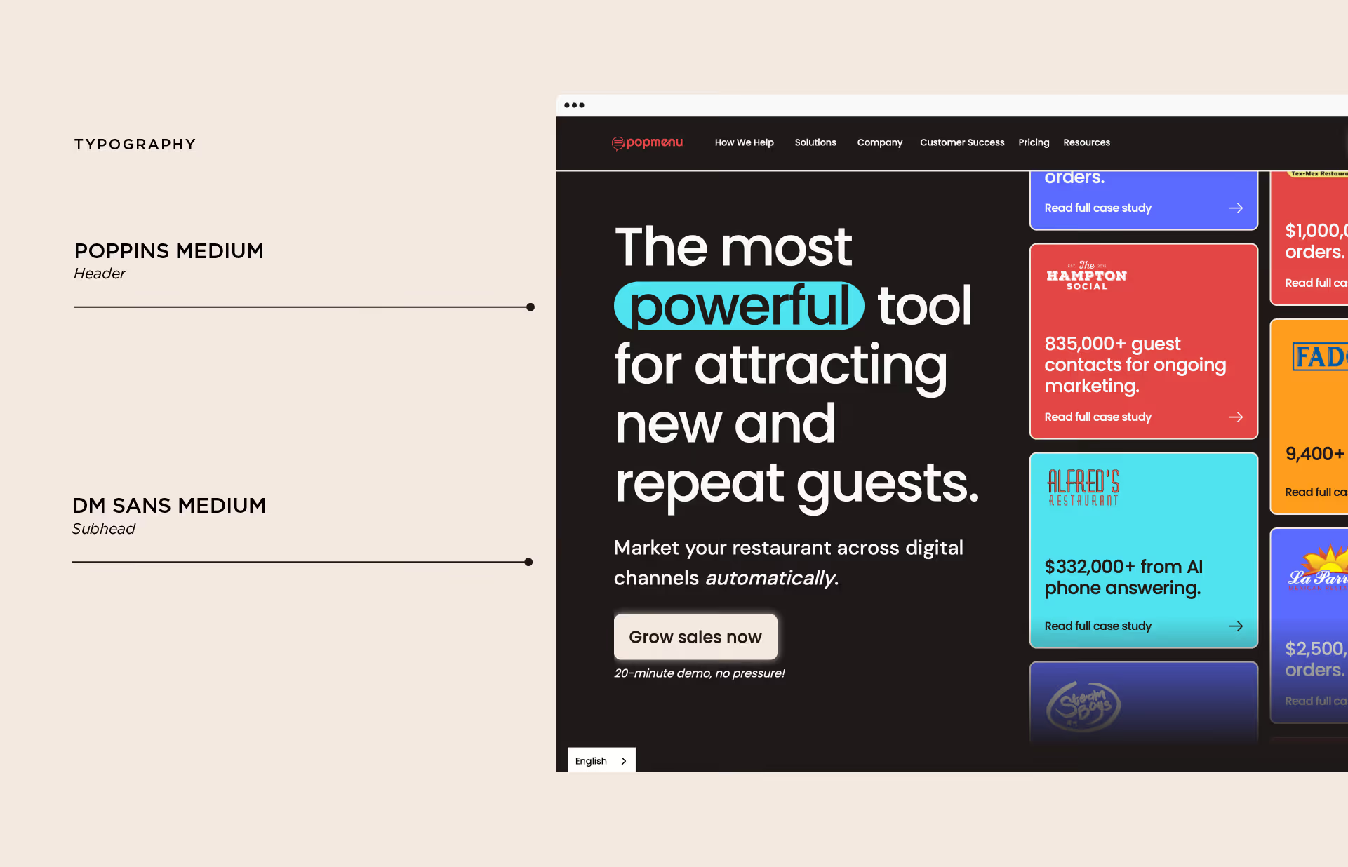
Typography & Art DirectionDigital & Campaign DesignWebsite Design Direction

The Problem

After meeting with the CEO, Co-Founder, and VP of Marketing, it became clear that Popmenu had outgrown its visual identity.

The product had evolved. The company had grown. But the brand still reflected an earlier stage.

In a restaurant technology market saturated with predictable SaaS design, Popmenu was blending in rather than standing apart. The visual system lacked distinction, authority, and scalability.

We needed more than a refresh. We needed a repositioning.

The Solution

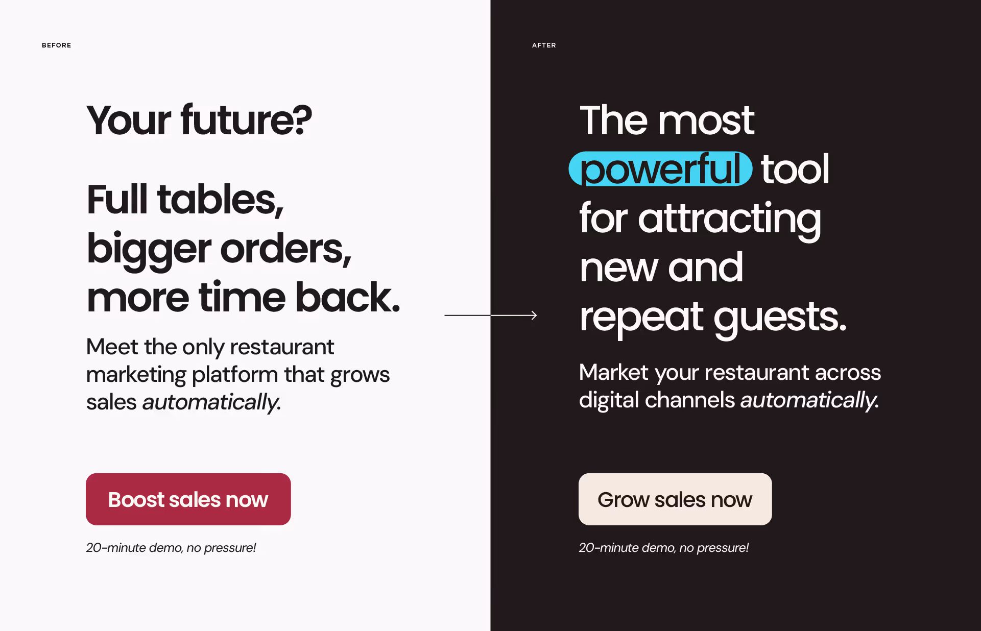
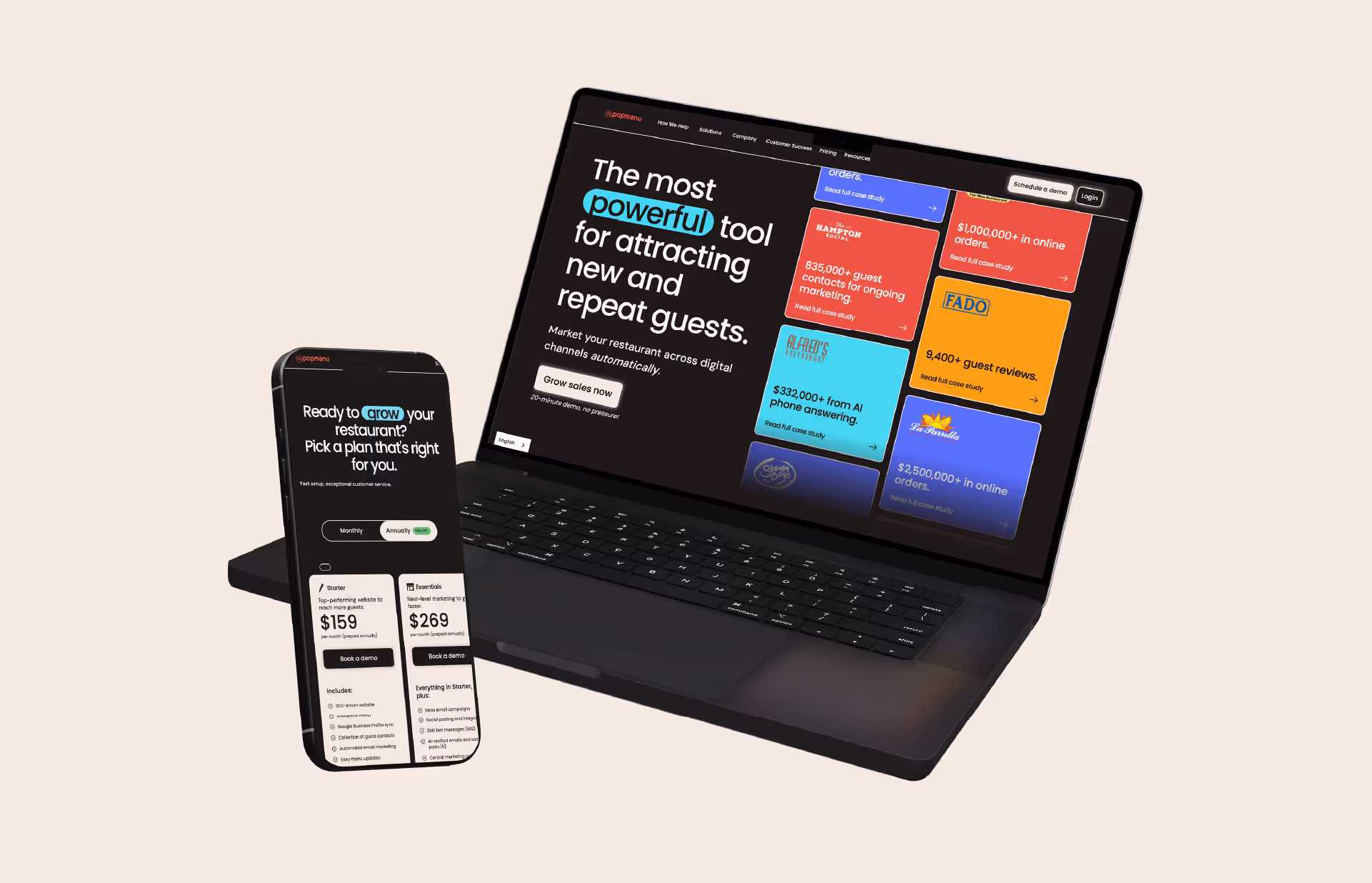
We built a bold, modern identity that matched the company’s growth and ambition.

As Senior Graphic Designer and the only designer on the marketing team, I led the full creative direction. I developed multiple strategic visual directions and built the selected system into a scalable brand framework.

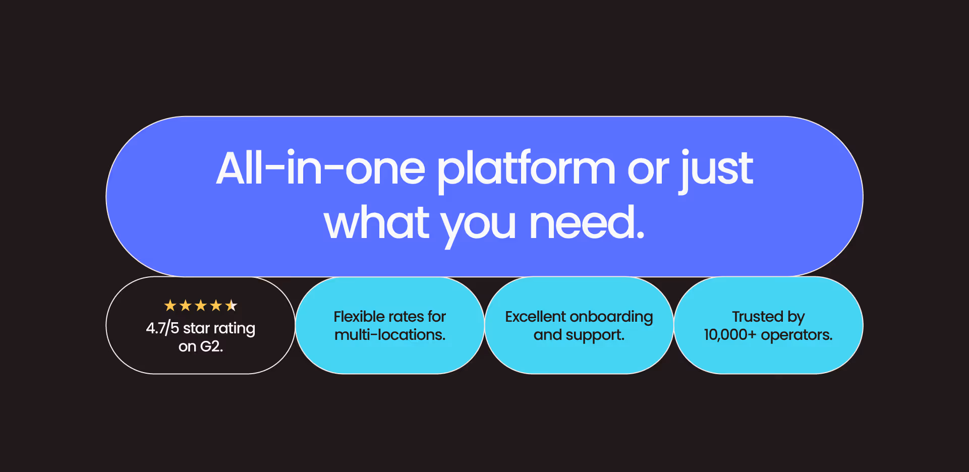
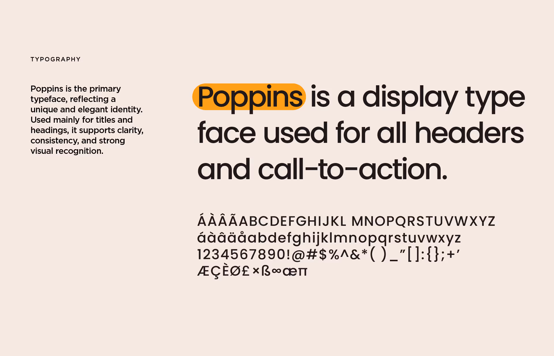
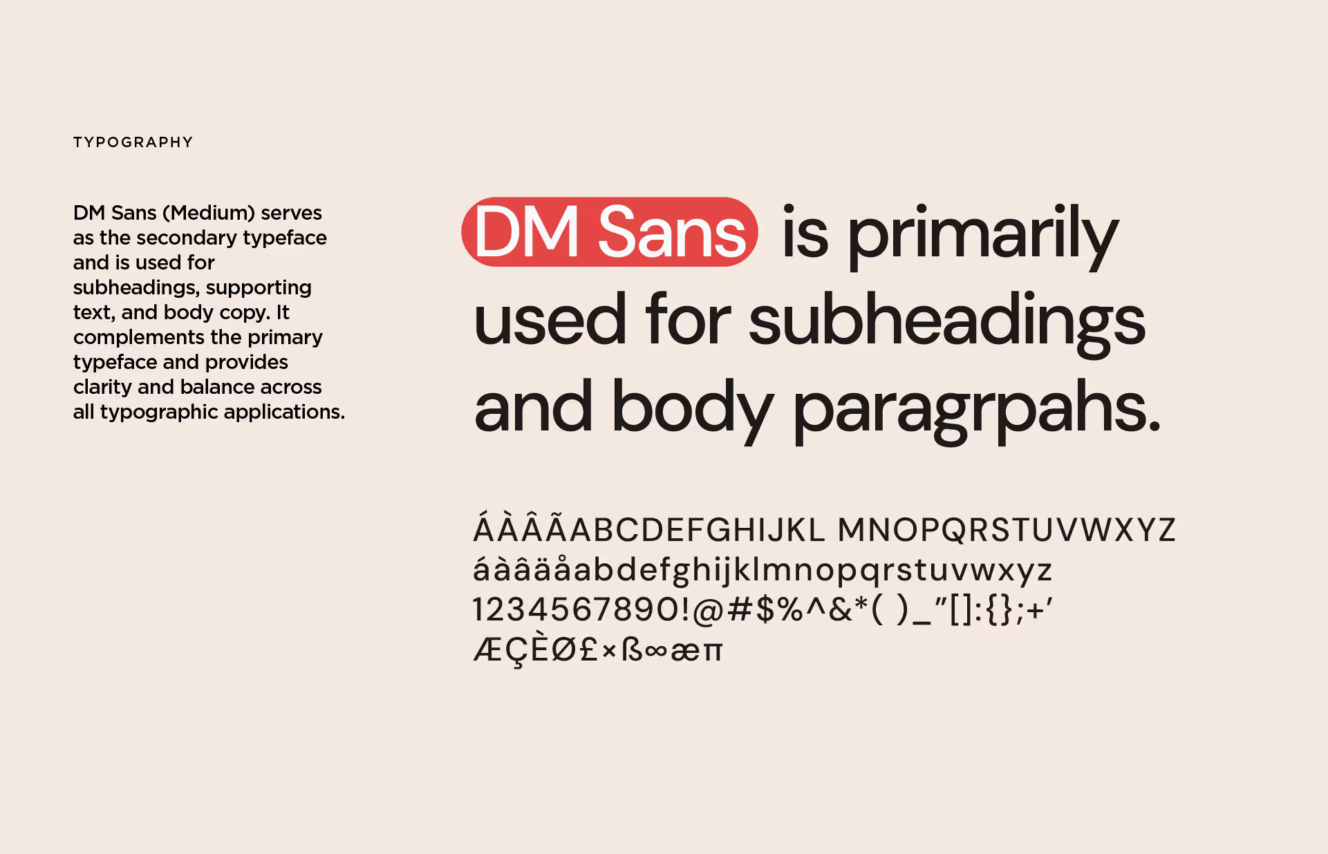
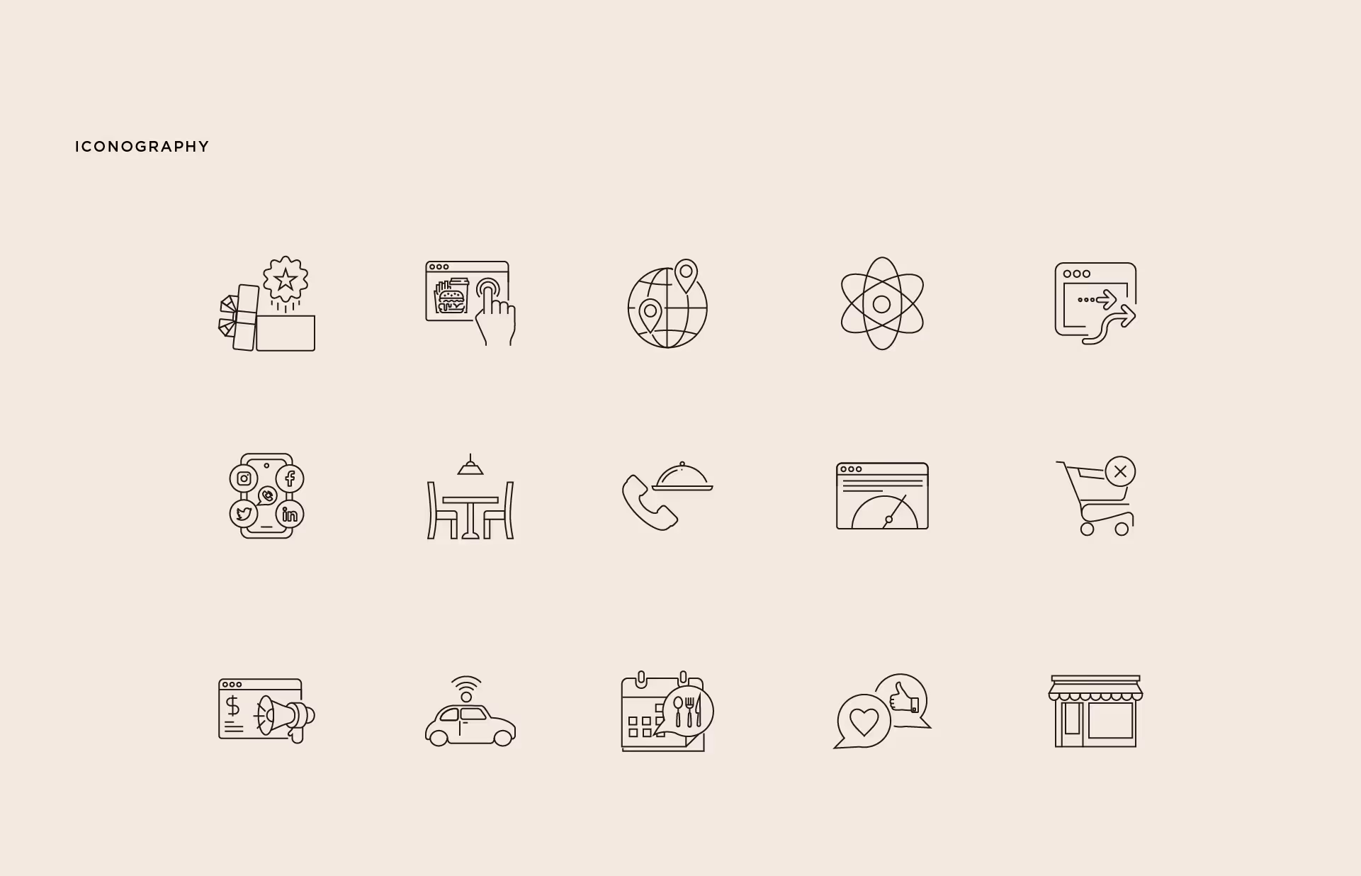
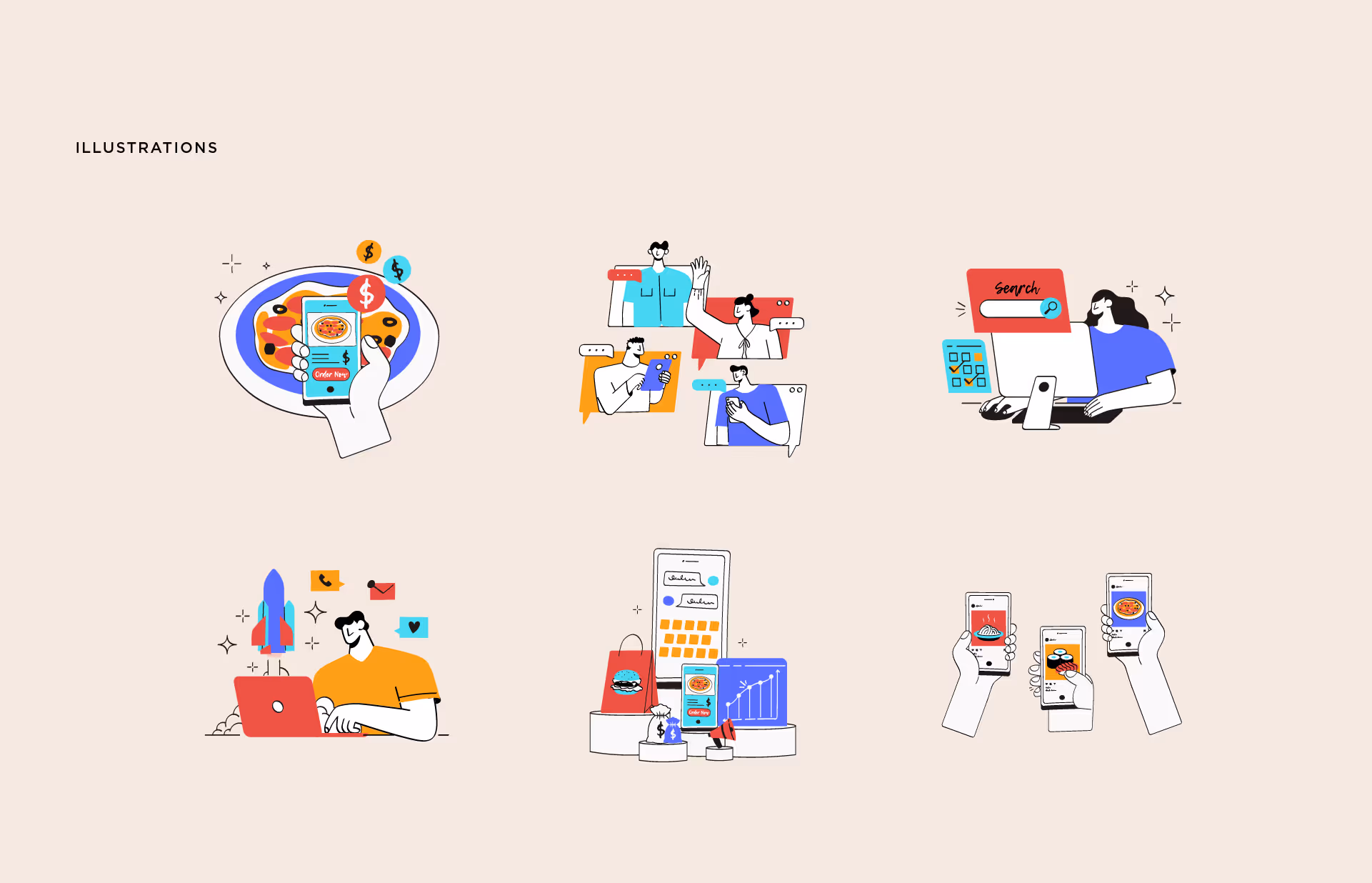
This included a refined typography hierarchy, expanded color system, updated visual language, and cohesive digital design standards.

The result is a more confident, differentiated brand positioned for long term growth.

The Project

As the sole designer driving the brand refresh, I led execution from concept through rollout.

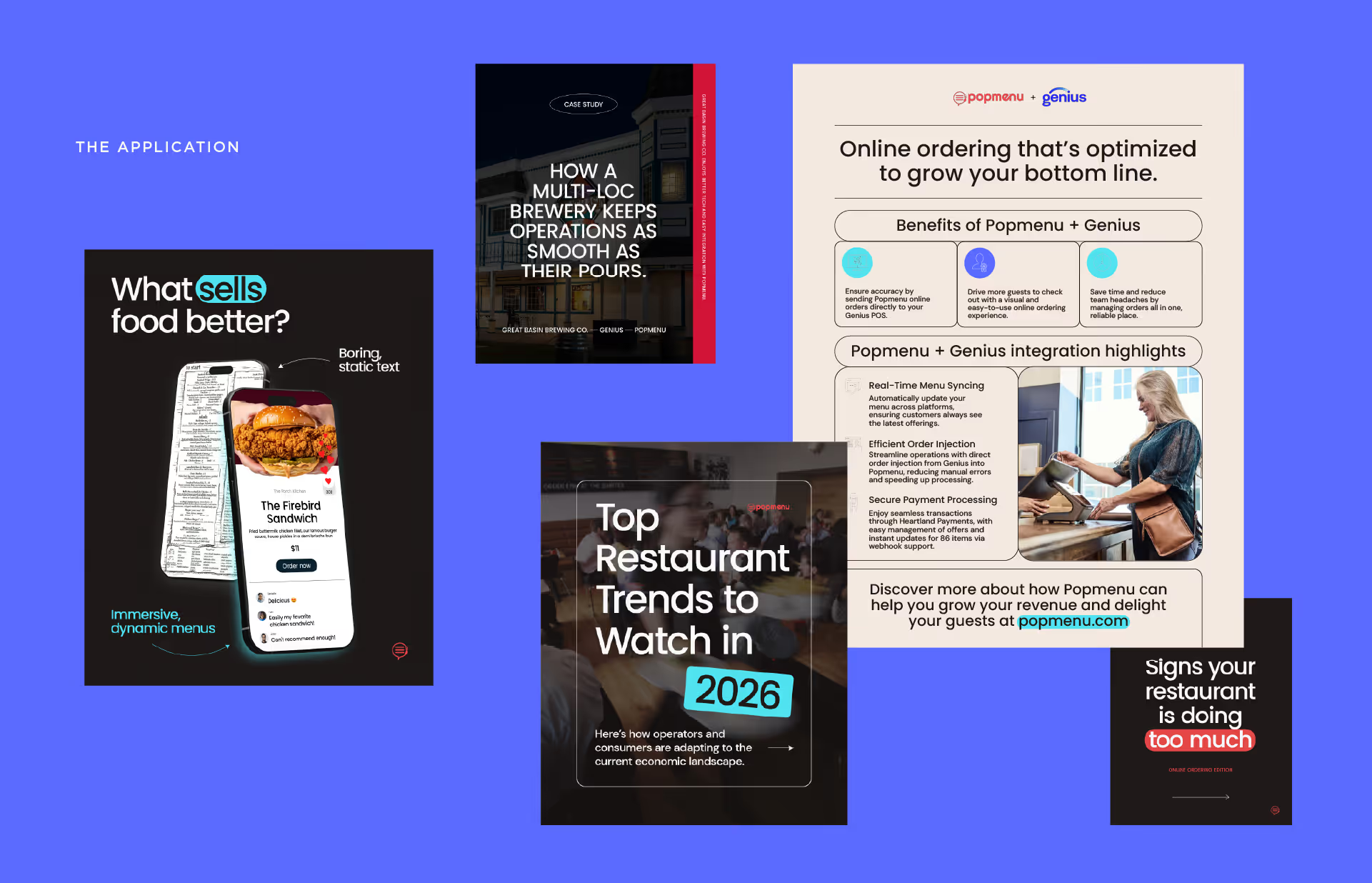
I translated the new identity into real-world applications across website design, campaign creative, sales materials, and digital marketing assets, ensuring consistency and scalability at every touchpoint.

This project reflects full creative ownership, strategic alignment with leadership, and end-to-end execution of a company-wide brand transformation.

-

Website: popmenu.com

Website landing page showcasing Popmenu's interactive menu platform with testimonials, integrations, media coverage, sales growth statistics, and a contact form on an orange background.Side-by-side comparison of restaurant marketing messages before and after rebranding, highlighting growth in sales and guest attraction.Blue rounded rectangle with the text 'All-in-one platform or just what you need,' above four smaller rounded rectangles highlighting features: 4.7/5 star rating on G2, flexible rates for multi-locations, excellent onboarding and support, and trusted by 10,000+ operators.Typography sample showing Poppins as the primary typeface with letters, numbers, and symbols in a clean, modern style.Typography sample showing DM Sans (Medium) font with uppercase, lowercase, numbers, and special characters on a beige background.Typography details showing Poppins Medium for header and DM Sans Medium for subhead alongside a website screenshot with the text ‘The most powerful tool for attracting new and repeat guests’ highlighted.Collage of Popmenu promotional graphics featuring dynamic menus, a brewery case study, restaurant trends for 2026, online ordering benefits, and signs a restaurant is overwhelmed.Grid of fifteen minimalist line icons, including gift box, touchscreen burger order, globe with location pins, atom, outbound arrow, social media, dining table, phone with food tray, speedometer, canceled shopping cart, online advertisement, connected car, calendar with food chat, heart and thumbs-up speech bubbles, and storefront.Six colorful digital illustrations depicting online food ordering, group chat, desktop search, entrepreneur with laptop and rocket, e-commerce with smartphone and shopping bags, and hands holding smartphones showing different food items.